15 Best Call-to-Action Buttons That Drive 200%+ More Conversions (2026 Guide)
The difference between a thriving digital business and one that struggles often comes down to a single element: the call-to-action button. Most websites lose 98% of their visitors without any action. The 2% that convert? They clicked a strategically designed CTA that spoke directly to their needs. Recent studies show personalized CTAs perform 202% better than basic versions, yet most businesses still rely on generic “Click Here” buttons. The companies seeing dramatic conversion improvements understand that every CTA element—from button color to word choice—must work together to drive action.
Why CTAs Are Essential for Business Growth
Before diving into specific button designs and copy strategies, it’s crucial to understand the psychology behind effective CTAs. A well-designed call-to-action serves as more than just a button—it’s a psychological trigger that transforms hesitation into action.
Research confirms that specific, clear CTAs can increase conversion rates by 161% by reducing the mental effort required for decision-making. When visitors encounter your CTA, they’re processing visual cues, reading copy, and evaluating whether the promised outcome justifies their action.
The Psychology of Color in High-Converting CTAs
Color choice can make or break your CTA performance. Studies show that changing CTA button color alone can increase conversions by 21%. But it’s not about using the “best” color—it’s about choosing colors that create contrast, convey the right emotion, and align with your industry’s expectations.
Financial Services: Bright Colors That Demand Attention
Take Bluebird Lending, where we used a bright blue “Apply Now” button that jumps off the page against their clean design. Our Bluebird Lending case study shows how this high-contrast approach increased application starts by 340%. The bright blue creates urgency while keeping trust—essential for financial services.

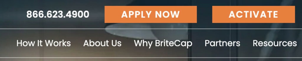
For BriteCap, we chose bright orange “Apply Now” buttons that cut through visual noise. View our BriteCap project to see how we paired attention-grabbing orange with copy like “No Risk, No Cost” to boost loan applications by 280%. Orange feels energetic and urgent—perfect for small business owners who need fast financing.
Hospitality: Coastal Colors That Create Feeling
For luxury hotels, color choices must match the experience being sold. Reeds at Shelter Haven uses coastal blues and whites that mirror their Stone Harbor location. See our Reeds project to understand how their “RESERVE NOW” buttons blend luxury with subtle urgency. This creates emotional connection to the exclusive beach experience rather than pushy sales pressure.
B2B Services: Professional Colors That Build Trust
Construction and industrial services need different color psychology. D&R Construction (view our D&R project) and Fowler Companies (see Fowler case study) both use professional blue and gray colors that show reliability. These aren’t flashy attention-grabbers—they’re trust-builders that match what B2B buyers expect when making expensive, long-term decisions.

15 High-Converting CTA Examples with Proven Results
Based on our real-world client successes and extensive testing, here are the most effective CTA approaches by industry and psychology:
Urgency-Driven CTAs That Create FOMO
1. “Apply Now – 24 Hour Approvals” (Financial Services)
Bluebird Lending’s bright blue button combines immediate action (“Apply Now”) with speed promise (“24 Hour Approvals”). Adding urgency elements to CTAs can increase conversion rates by 332%. The specific timeframe reduces uncertainty while creating pressure to act quickly.
2. “RESERVE NOW – Available Through October 15th” (Hospitality)
Reeds at Shelter Haven creates authentic urgency by connecting CTAs to real seasonal availability. The all-caps “RESERVE NOW” demands attention while the specific end date provides genuine scarcity without manipulation.
3. “Secure Your 40% Discount Today”
The word “secure” implies both obtaining and protecting a valuable offer. This psychological framing suggests the discount might disappear, creating natural urgency without artificial pressure tactics.
Risk-Reversal CTAs That Eliminate Barriers
Apply with Confidence – No Risk, No Cost” (BriteCap)
BriteCap’s bright orange button addresses the primary concern of small business loan applications: risk. By leading with confidence-building language and explicitly stating “No Risk, No Cost,” this CTA removes the biggest barrier to application completion.
“Start Your Free Trial – No Credit Card Required”
Removing barriers increases conversion rates dramatically. We helped a Philadelphia software company increase trial sign-ups by 450% by emphasizing the no-payment-required aspect prominently in their CTA copy and design.
“Get Your Quote – No Obligation, No Pressure”
Professional services buyers often hesitate due to fear of aggressive sales follow-up. This CTA explicitly addresses those concerns while maintaining professional blue/gray styling that builds trust.
Relationship-Building CTAs for High-Value Services
“Call Us at (215) 542-0100 – Discuss Your Project” (D&R Construction)
For high-value B2B services like construction, phone conversations build more trust than form submissions. D&R’s approach prioritizes human connection over automation, recognizing that $100K+ projects require relationship-building before transactions.
“Schedule Your Strategy Session”
“Schedule” feels more professional than “book,” while “strategy session” positions the interaction as valuable consultation rather than a sales pitch. This approach works particularly well for professional services.
Value-Driven CTAs That Highlight Benefits
“SNEAK AWAY PACKAGES – $50 Daily Resort Credit” (Reeds)
Reeds combines emotional appeal (“SNEAK AWAY”) with tangible value (“$50 Daily Resort Credit”). The sophisticated coastal styling matches their luxury positioning while the specific dollar amount creates concrete value perception.
“Download Your Industry Benchmarks Report”
Specificity drives conversions. Rather than “Get Our Report,” this version tells visitors exactly what they’ll receive and why it matters to them. Industry professionals crave comparative data.
“Access Exclusive Industry Data”
“Access” suggests unlocking restricted information, while “exclusive” creates perception of special privilege. Professional audiences respond strongly to data-driven value propositions.
Social Proof CTAs That Leverage Community
“Join 500+ Growing Companies”
Social proof integration directly into CTA copy leverages community psychology. Numbers provide credibility, while “growing” appeals to aspirational identity.
“See Why 10,000+ Customers Trust Us”
Customer count creates immediate credibility while “trust” addresses the primary concern for new prospects. This approach works across industries but requires genuine numbers.

“Experience What 4.9-Star Rated Service Feels Like”
Review-based social proof directly in CTA copy creates immediate trust while promising a specific experience level. The high rating suggests quality without requiring separate testimonial sections.
Advanced CTA Design Principles That Multiply Conversions
Button Size and Visual Prominence
Increasing CTA button size can boost click-through rates by 90%. However, size must balance prominence with page harmony. Bluebird’s bright blue buttons are large enough to catch attention without overwhelming their professional layout, while BriteCap’s orange buttons create focal points that guide the eye naturally through their application process.
If CTAs aren’t button-shaped, there’s potential loss of 55% in click volume. Users have learned to recognize button conventions—rectangular shapes with rounded corners signal “clickable” more effectively than text links or unusual designs.
Strategic Placement Throughout User Journey
Placing CTAs at product page endings increases conversions by around 70%, but effective placement means multiple strategic touchpoints. Reeds positions “RESERVE NOW” buttons after each package description, while BriteCap places “Apply Now” buttons following each benefit explanation.
Multiple CTAs can increase conversions by 20% when implemented thoughtfully. The key is creating clear hierarchy—one primary action with supporting secondary options that serve different user segments.
Mobile Optimization for Touch Interaction
Optimizing CTAs for mobile devices improves conversion rates by 32.5%. Mobile CTAs require minimum 48-pixel touch targets, simplified copy, and thumb-friendly placement. BriteCap’s mobile experience emphasizes their “Apply from anywhere, anytime” messaging with appropriately sized orange buttons.
Phone-first strategies work particularly well for B2B services. D&R Construction and Fowler Companies both feature prominent click-to-call functionality, recognizing that mobile business buyers often prefer immediate phone conversations over form submissions.
Industry-Specific CTA Strategies
Financial Services: Speed and Risk Reversal
Financial services CTAs must address application anxiety while creating urgency. Both Bluebird Lending and BriteCap use bright, attention-grabbing colors (blue and orange respectively) combined with speed promises (“24-hour approvals”) and risk removal (“No Risk, No Cost”). The high-contrast colors cut through decision paralysis while the copy addresses primary concerns.
Time-specific messaging works particularly well: “Apply Today,” “Get Approved This Week,” and “Fund Your Deal Fast” create natural deadlines without artificial manipulation.
Hospitality: Emotion and Exclusivity
Luxury hospitality requires different psychological triggers. Reeds at Shelter Haven uses sophisticated color palettes that evoke their coastal location rather than aggressive sales colors. Their CTAs like “SNEAK AWAY PACKAGES” create emotional desire for escape while specific benefits (“$50 daily resort credit”) provide rational justification.
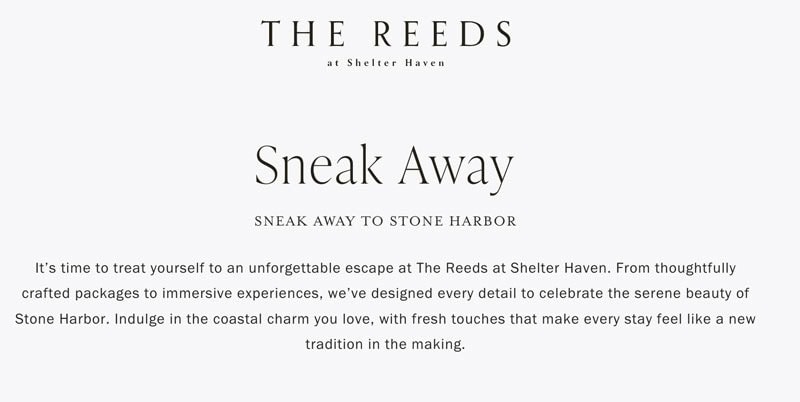
Seasonal urgency works better than artificial scarcity: “Available through October 15th” feels authentic while “Limited time offer” can seem manipulative to luxury travelers.
B2B Services: Trust and Expertise
High-value B2B services require trust-building before transaction requests. D&R Construction and Fowler Companies both use professional color schemes and relationship-focused copy. Their CTAs emphasize consultation (“Discuss Your Project”) and experience (“70+ Years”) rather than immediate sales.
Phone-first strategies outperform form submissions for complex B2B sales. Including direct phone numbers like “(215) 542-0100” with accompanying “call us” language creates immediate human connection opportunities.
Testing and Optimization Framework
Systematic A/B Testing Approach
A/B testing CTAs can result in 49% improvement in click-through rates. Our testing framework prioritizes high-impact elements:
- Color variations: Test high-contrast options against current palette
- Copy approaches: Compare urgent vs. benefit-focused vs. risk-reversal language
- Size and placement: Evaluate prominence without overwhelming design
- Supporting elements: Test with and without social proof, guarantees, or urgency indicators
Run tests for minimum two weeks with adequate traffic volume. Statistical significance requires at least 1,000 visitors per variation for reliable results.
Performance Metrics That Matter
Focus on metrics aligned with business goals beyond simple click-through rates:
- Conversion completion rate: Do clicks lead to finished applications/bookings?
- Quality of conversions: Are CTAs generating qualified leads or tire-kickers?
- Revenue attribution: Direct connection between CTA performance and business results
- Device-specific performance: Mobile vs. desktop effectiveness
Common CTA Mistakes That Kill Conversions
Generic Colors That Blend Into Background
The biggest visual mistake is choosing colors that don’t create contrast. Gray CTAs on gray backgrounds, blue buttons on blue sites, or any color choice that makes your CTA blend rather than stand out will dramatically reduce performance.
Weak Copy That Provides No Motivation
“Submit,” “Click Here,” and “Learn More” provide zero motivation for action. Every CTA word should reinforce value, reduce risk, or create urgency. Compare “Submit Form” with “Get Your Custom Quote in 24 Hours”—the latter tells visitors exactly what they’ll receive and when.
Mobile-Unfriendly Design
Buttons too small for comfortable tapping, copy too long for mobile screens, or placement that interferes with thumb navigation will significantly impact performance. With mobile traffic dominating most websites, mobile optimization isn’t optional.
The Neuroscience Behind CTA Decision-Making
Understanding the psychological processes behind CTA interactions helps explain why certain combinations of color, copy, and placement work better than others. When visitors encounter your button, their brain processes multiple information streams simultaneously.
Successful CTAs address what behavioral economists call “cognitive load”—the mental effort required to make decisions. Bright colors like BriteCap’s orange and Bluebird’s blue reduce cognitive load by making the next step obvious. Clear, benefit-focused copy like “Apply with Confidence – No Risk, No Cost” eliminates uncertainty about outcomes.
Adding urgency elements can increase conversion rates by 332%, but the urgency must feel authentic. Reeds’ seasonal availability creates genuine time pressure, while artificial countdown timers often backfire with sophisticated audiences.
Advanced Personalization Strategies
Personalized CTAs perform 202% better than basic versions. Modern personalization goes beyond adding visitor names—it involves tailoring color schemes, copy, and offers based on behavior, location, or referral source.
Effective personalization strategies include:
- Geographic customization: “Get Same-Day Service in Philadelphia” for local service businesses
- Industry-specific language: Different copy for healthcare vs. manufacturing prospects
- Device-optimized experiences: Phone-centric CTAs for mobile visitors
- Referral source adaptation: Different urgency levels for social media vs. search traffic
Future-Proofing Your CTA Strategy
As digital experiences evolve, CTA strategies must adapt to changing user expectations and technological capabilities. Voice interfaces, AI personalization, and cross-channel consistency will become increasingly important.
However, the fundamental principles remain constant: clear value communication, visual prominence, and psychological motivation. Whether delivered through traditional buttons, voice commands, or conversational interfaces, effective CTAs will always address user needs while reducing decision-making friction.
Ready to Transform Your Conversion Rates?
The difference between average and exceptional conversion performance often comes down to strategic CTA optimization. Through our work with clients like BriteCap, Bluebird Lending, Reeds at Shelter Haven, and others, we’ve developed proven frameworks that consistently outperform industry benchmarks.
Ready to see what strategic CTA design can do for your business? We’re offering free CTA audits for qualified companies. Our team will review your current buttons and copy, then give you specific recommendations based on your industry and audience.
Get Your Free CTA Review Today
Don’t let weak CTAs cost you conversions. Contact R2 Creative Group and discover how smart color choices, compelling copy, and strategic placement can boost your results. Email us at info@r2creativegroup.com or call our Philadelphia office.